
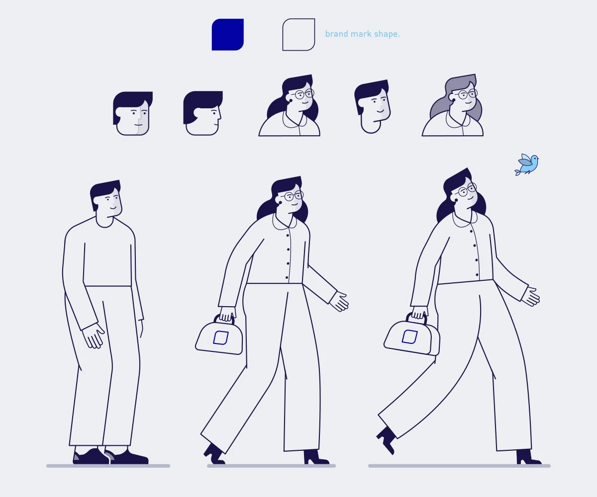

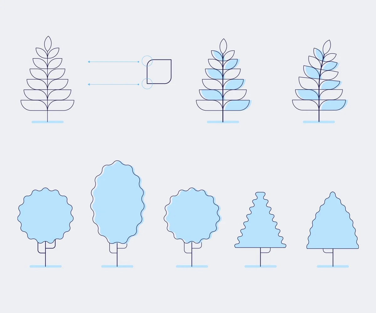
Home was a set of treatment designs for a client who wanted some options of how a visual language could support different segments of their business. We worked with a limited colour palette and line detail. Being their business was set around realestate we felt people needed to bring warmth to the visual story. In this treatment the visual language was inspired from the original brand mark.